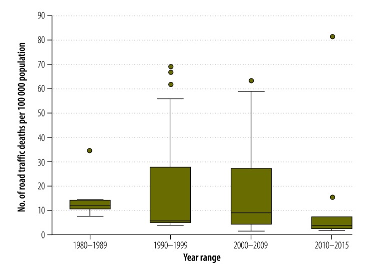
Fig. 5.
Pooled road traffic death rate, Africa, 1980–2015
Note: In the box plot, the boxes represent the interquartile range of road traffic injury rates where the middle 50% (25–75%) of data are distributed; the bars represent road traffic injury rates outside the middle 50% (< 25% or > 75%); the dots represent specific road traffic injury rates which were a lot higher than normally observed over the study period (outliers) and the lower, middle and upper horizontal lines represent the minimum, median and maximum road traffic injury rates (excluding outliers), respectively.

