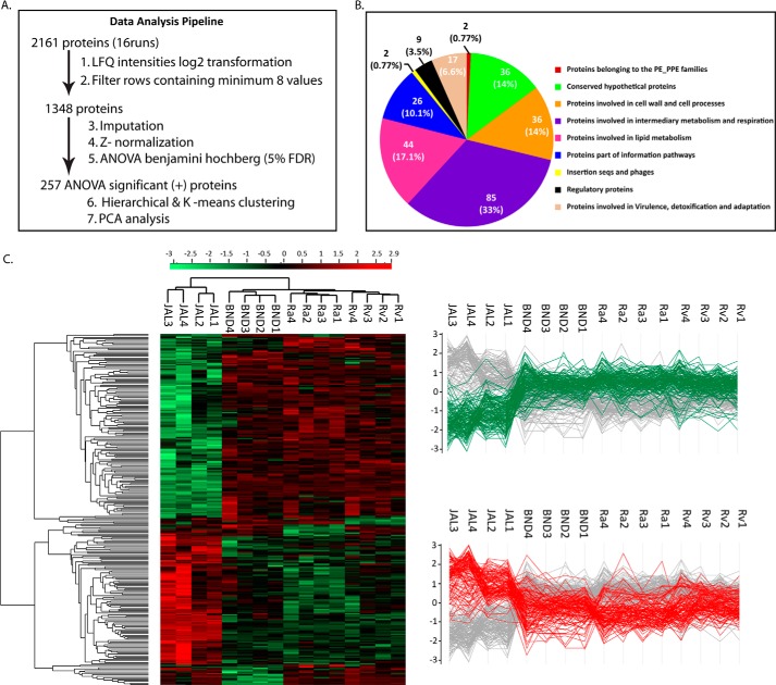
FIGURE 3.
Relative protein quantification. A, brief overview of data analysis steps. B, Venn diagram showing details of tuberculist classification of functional categories among the ANOVA-significant proteins. C, left panel, clustergram of the ANOVA-significant 257 proteins differing among the four strains. The Z-scored normalized abundance values of proteins are represented by red (high abundance) and green (low abundance) colors as indicated in the color scale bar at the top. The two highlighted clusters represent proteins with decreased (green) and increased (red) abundance in the JAL strain. Right panel, profile plots displaying the low and high abundant clusters of clustergram with respect to the JAL strain.

