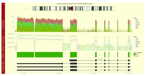
Figure 7. Example region cluster plot for the derfinder use case example with the BrainSpan dataset.
Coverage curves are shown for each sample colored by their group membership. Mean coverage curves by group, differentially expressed regions (DERs) and known transcripts are shown in the remaining tracks.

