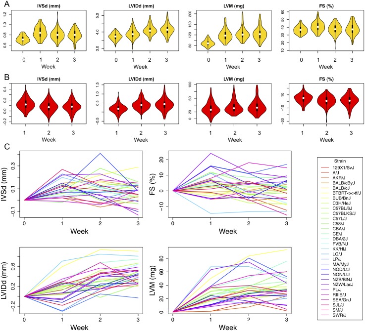
Fig 3. Population distribution of echocardiographic measures at each time point.
The violin plot is a combination of a boxplot and a kernel density plot (a smooth histogram) rotated on its side. The white dot represents the median. The black box represents the interquartile range (IQR). The black vertical line represents the whiskers spanning the lowest and the highest data within 1.5 IQR from the lower and upper quartile. A) The population distribution at each ISO treatment time point. B) The distribution of the changes in echocardiographic measures from baseline. C) The changes in echocardiographic measures compared to baseline at each ISO time point for individual classical inbred strains.

