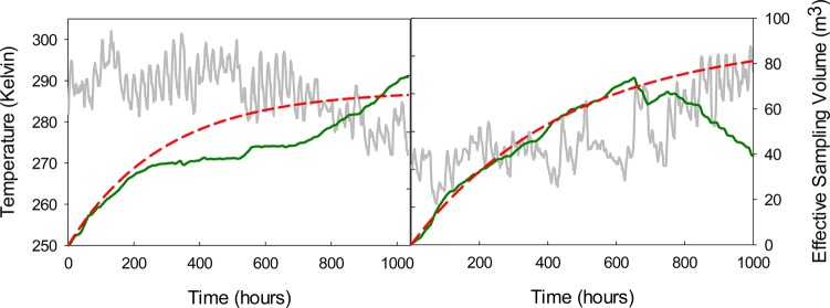
Figure 3.
Example effective sampling volume curves for deployments with decreasing temperature (left) and increasing temperature (right) at a Koa of 106 (∼PCB 1). The solid gray line represents hourly air temperature. The solid green line represents the effective sampling volume calculated using the method of this study, including hourly adjustments on kv and KPUF. The dashed red line, represent effective sampling volume calculated using average values for kv and KPUF.

