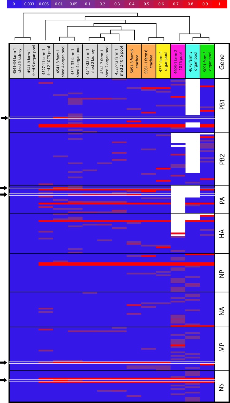
FIG 4.
Heatmap of the nucleotide frequency. The horizontal axis represents the samples, colored according to the farm of collection, while the vertical axis display only the variable nucleotide positions showing nucleotide differences compared to samples 4541-9 and 4541-34. The color scale represents the nucleotide frequency according to the scale bar at the top of the figure. White spaces represent positions for which deep-sequencing data were not available (coverage < 500). Black arrows indicate the variants that are fixed in the viral population of at least one sample of the first infected farm. The dendrogram above the heatmap represents the neighbor-joining tree obtained from the distance matrix calculated from the deep-sequencing data.

