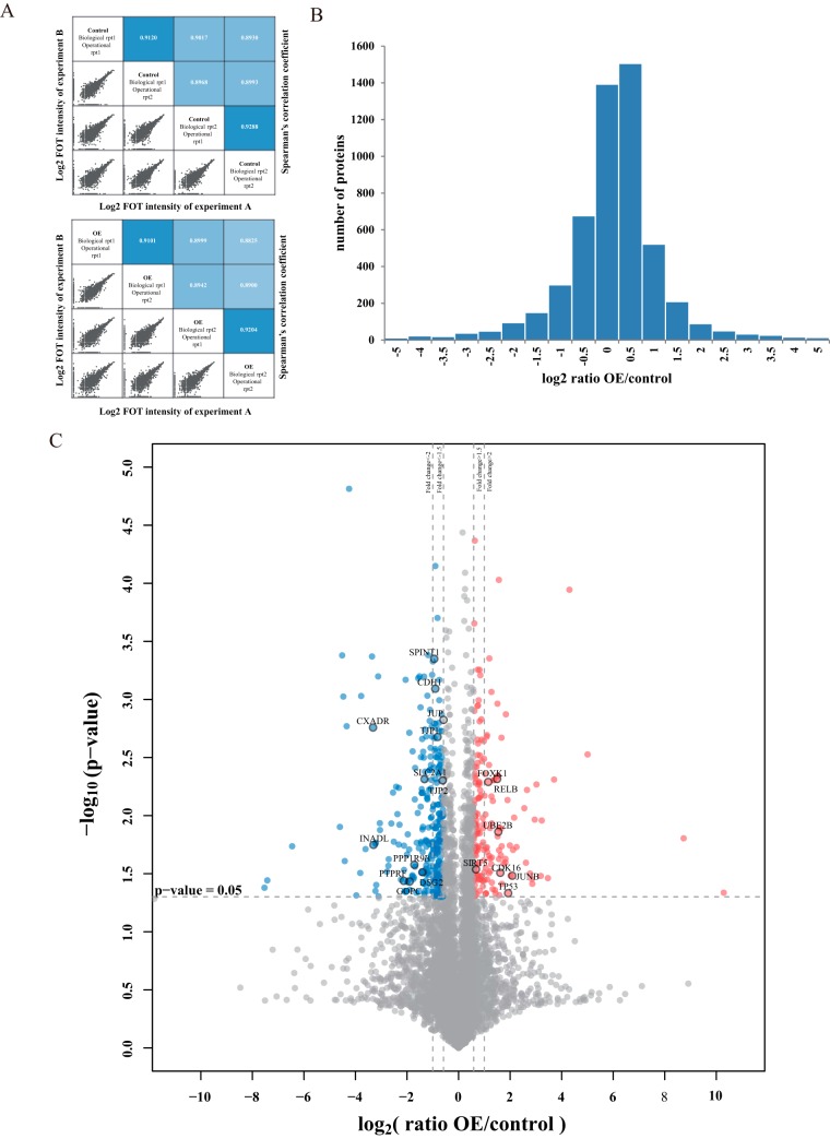
Fig. 2.
Whole proteome profiling of UHRF2 overexpression cells by label-free quantitative MS analysis. A, The up panel shows the correlation of control experiments and the down panel shows the correlation of OE groups. In each panel, the lower-left half depicts pairwise scatter plots of the experiments, with x and y axes representing log2 FOT intensity of experiments in corresponding columns and rows, respectively. The upper-right half depicts pairwise Spearman's correlation coefficients for the same comparisons. B, The distribution of protein abundance ratios is displayed with histogram. The log2 fold change of OE/control is shown on the x axis and the corresponding protein numbers are shown on the y axis. (C) Identification of the differentially expressed proteins. The log2 mean ratio of four replicates was plotted against the corresponding -log10 p value. The vertical dotted lines mark 1.5- and twofold change and the horizontal dotted line represent the cutoff of p value = 0.05. Proteins that exhibited fold change greater than 1.5-fold and p value<0.05 were considered up-regulated and marked with red. Proteins that decreased more than 1.5-fold and had p values<0.05 were considered downregulated and marked with blue. The gray proteins were considered with nonsignificant change.

