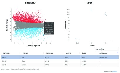
Figure 6.
Interactive mean-difference plot generated using Glimma. Summary data (log-FCs versus log-CPM values) are shown in the left panel which is linked to the individual values per sample for a selected gene in the right panel. A table of results is also displayed below these figures, along with a search bar to allow users to look up a particular gene using the annotation information available, e.g. the Gene symbol identifier Clu.

