
Figure 2.
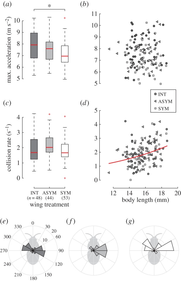
Maximum two-dimensional acceleration (a,b) and collision rate (c,d). Box and whisker plots show the median, quartiles and range of data points, with outliers plotted as plus signs. Asterisk indicates a significant difference. Line in (d) shows the predicted collision rate from the generalized linear model. (e–g) Angle histograms of maximum two-dimensional acceleration relative to body orientation for each treatment. (Online version in colour.)