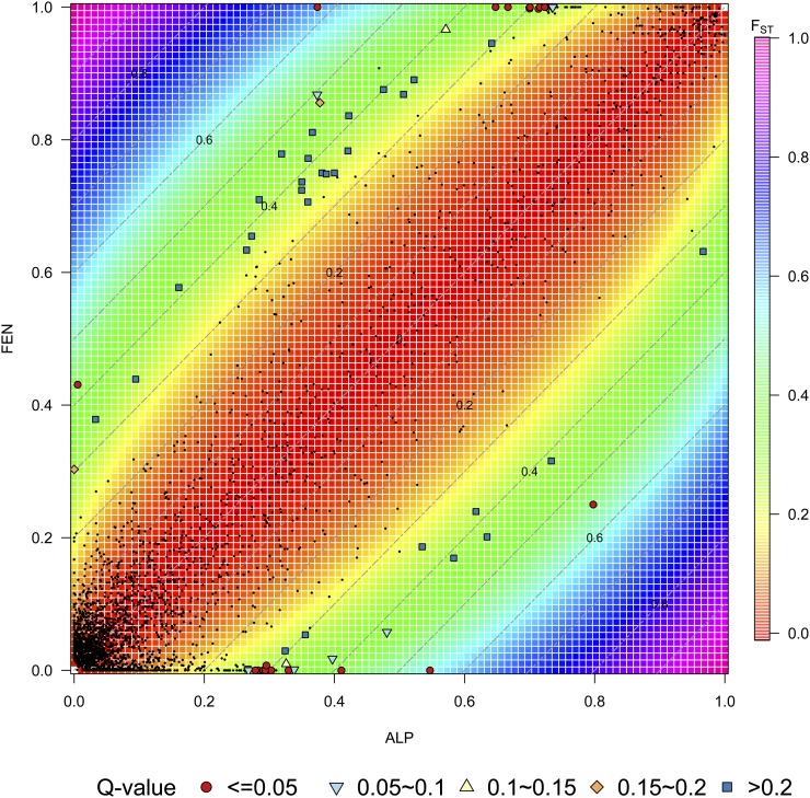
Figure 5.
Relationship between FST and allele frequency difference. The color strips show the FST contours, and the gray dash lines parallel to the diagonal show the AFD contour lines. SNPs used in this study were mapped using points: small black dots are SNPs with divergence distance under 97.5% tail of simulated distribution, while outliers are shown in difference shapes, and colors corresponding to their q-values calculated by BayeScan. The red dots correspond to outliers for FST values, and allele frequencies that were also outliers with BayeScan with Q-value ≤ 0.05. The analysis based on FST and allele frequency difference also picks outliers with BayeScan Q-value ranging from 0.05 to 0.8.

