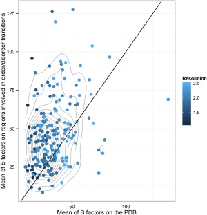
Figure 3.

B‐factor comparison between regions under order‐disorder transitions and the average of the whole protein. The blue scale indicates different resolutions and the gray lines indicate the contour of the bi dimensional density: It can be seen that the mean B factor population of order‐disorder regions has a mean over the protein mean B factor since the center of the bi dimensional density is over the x = y line.
