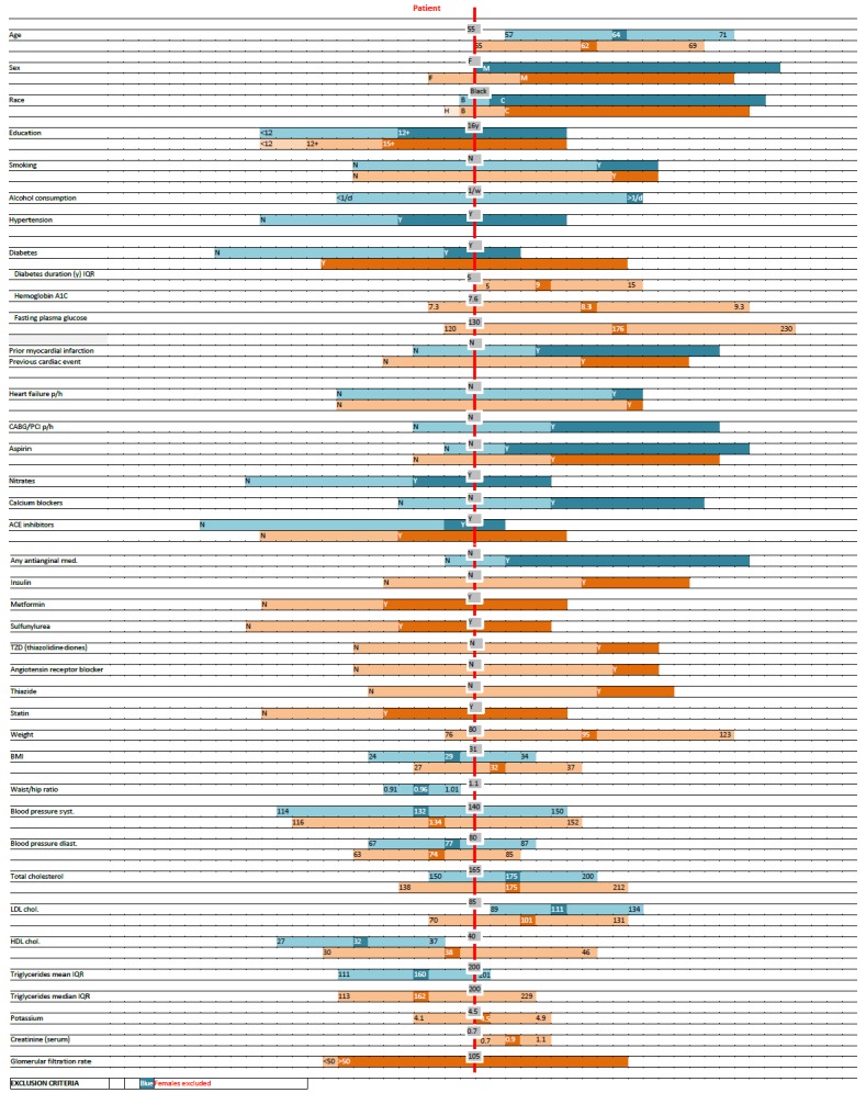
Fig. 1.

An example of a Scale Chart comparing a patient’s characteristics (red vertical line, grey boxes) to the distribution of reported population characteristics of two clinical trials (blue and orange horizontal bars). Each bar represents the mean or median and the standard deviation or interquartile range (IQR), as indicated, for continuous variables, and relative frequency for categorical variables. Horizontal bars are aligned to correspond to the patient’s characteristics. Different tones are used for different categories.
