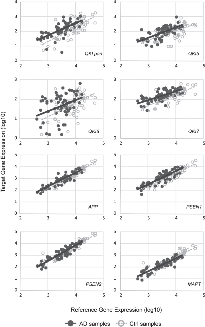
Fig.1.
Scatterplots of gene expression values. sAD samples are shown in filled circles with solid line of best fit. Control samples are shown in open circles, with dashed line of best fit. Y-axis shows the target gene expression value. X-axis shows the geometric means of the reference genes (ACTB and GAPDH). All values are log10.

