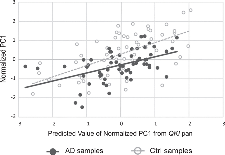
Fig.3.
Scatterplot showing principal component (PC1) values of APP, PSEN1, and PSEN2 gene expression, with values of PC1 predicted from QKI pan (standardized regression values). sAD samples are shown in filled circles with solid line of best fit. Control samples are shown in open circles, with dashed line of best fit. The distance between the circles and the line of best fit is representative of model accuracy, with shorter distances equating to a better fit.

