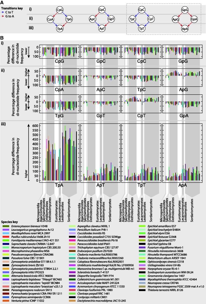
Fig. 6.
Possible changes to dinucleotide pairs are described in a series of graphs (A). Dinucleotides are represented by nodes, and arrows represent possible changes resulting from C to T (blue) and G to A (red) transitions. Dinucleotides are organized into bands marked (i), (ii), and, (iii) based on the number of mutable sites they have (2, 1 and 0, respectively). Below each graph, corresponding plots (B) of percentage differences between dinucleotide frequencies within and outside AT-rich regions are shown for species with 5% or greater AT-rich region content. Percentage differences above y = 0 correspond to higher values within AT-rich regions and below y = 0 correspond to lower values within AT-rich regions (see axis labels). Each species is represented by a different color as shown in the species key and arranged according to taxonomy. Vertical grey bands group species by class, with class names marked at the bottom of (B).

