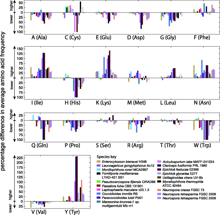
Fig. 8.
Percentage differences between average amino acid content of genes within and outside AT-rich regions are shown. Different colors correspond to different fungal species as per the key (bottom right). Bars that have a solid fill color show where the difference in amino acid frequency is statistically significant (Mann–Whitney U test, P= 0.05). Percentage differences above y = 0 correspond to higher values within AT-rich regions and below y = 0 correspond to lower values within AT-rich regions (see axis labels).

