
Figure 4.
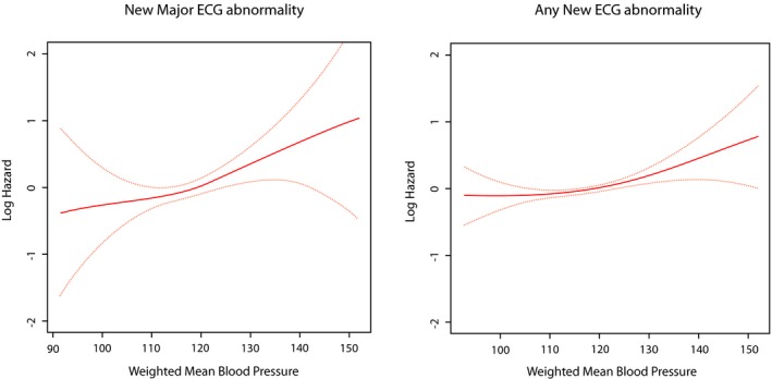
Risk of new ECG abnormalities across different levels of weighted mean systolic blood pressure. The red line represents the log hazard (Y axis) of ECG abnormalities associated with different levels of weighted mean systolic blood pressure (Y axis). The yellow line represents the 95% CI of the log hazard (Y axis) of ECG abnormalities associated with different levels of weighted mean systolic blood pressure (Y axis). ECG indicates electrocardiogram.