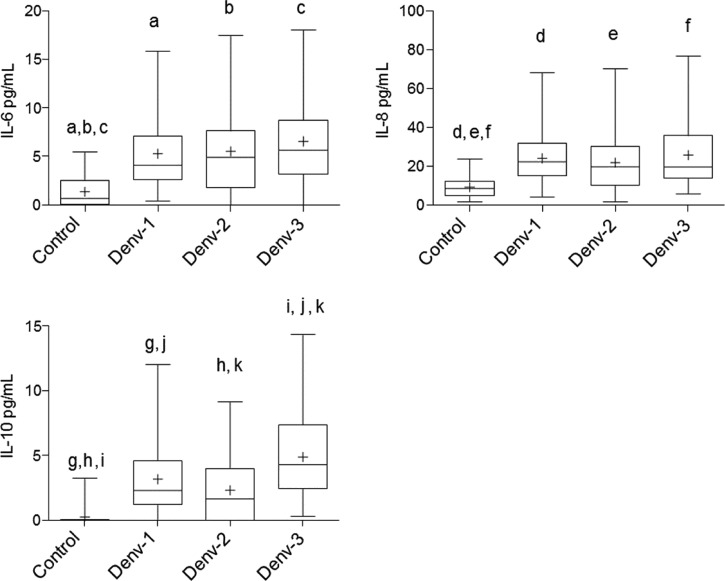
Figure 3.
Cytokine comparisons between patients positive for Dengue virus (DENV) serotypes 1, 2, and 3 and control individuals. The data are shown as box plots with the box extending from the 25th to the 75th percentiles, the line in the middle the median, and the + the mean. The whiskers represent the max/min values. Differences were considered significant at P < 0.05 using the two-tailed analysis of variance with corrections for multiple comparisons (Tukey) and were indicated by the same letters.

