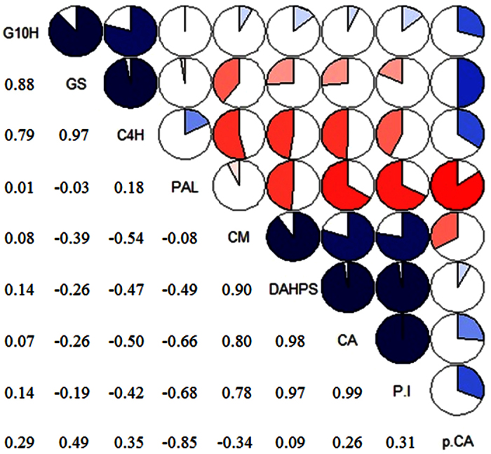
Figure 6. Correlogram showing correlations of tested genes and metabolites data.

Pearson’s correlation coefficients in genes and metabolites from the control, CA, CAT and CA+CAT treatment’s group. The data having similar patterns are grouped together and presented in the form of pie graphs filled in proportion to the Pearson’s coefficient values. Blue colored pie graphs filled clockwise indicate positive correlations while red colored pie graphs filled anti-clockwise indicate negative correlations.
