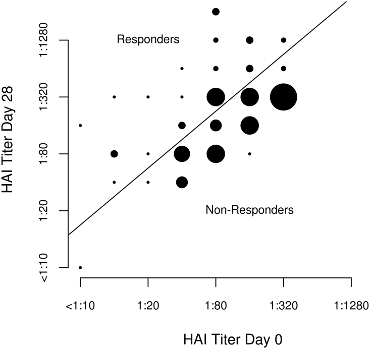
Fig. 1.
Comparison of baseline HAI titer values to Day 28 HAI titer values. Scatterplot of the HAI titer at Day 28 versus the HAI titer at baseline. The points on the graph are proportional to the number of individuals with the corresponding titers. The line through the plot is the divide between the responders and the non-responders and is based on a four-fold change from baseline to Day 28. Subjects above the line have a 4-fold or greater change and are responders, while the subjects below the line are classified as non-responders.

