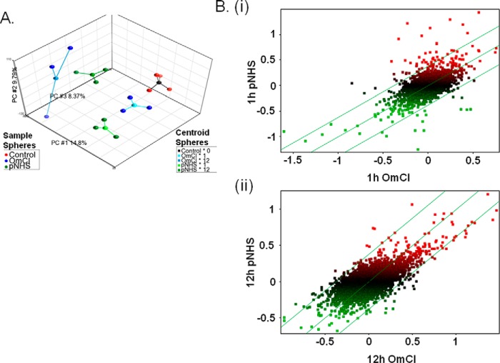
FIGURE 2.
Primary microarray data analysis. A, PCA plot of top three principle components. Three-dimensional plot showing the top three principle components of the microarray data as calculated using PCA. Contributing principle components (PC) are labeled on each axis alongside the calculated % contribution to overall variation. Each sample from the experiment is represented by a colored sphere; red = control, green = pNHS, blue = pNHS+OmCI. A centroid sphere shows how these samples are grouped according to their experimental conditions; black = control, pale blue = OmCI at 1 h, darker blue = OmCI at 12 h, light green = pNHS at 1 h, and darker green = pNHS at 12 h. B, scatter plot comparisons between samples exposed to pNHS and pNHS+OmCI at 1 (i) and 12 (ii) hours. Data are log2 transformed, median baseline-adjusted. Expression is presented as distribution around a median that represents equal gene expression in the two conditions. The parallel flanking lines represent gene expression changes of ±1.3-fold change; data points falling outside these lines are considered to be differentially expressed. Data points are colored according to their expression levels (median baseline-adjusted) upon exposure to pNHS; green = below median, red = above median.

