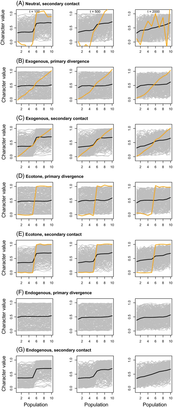
Figure 1.

Plots show neutral allele frequency (gray) and quantitative trait (orange) clines from simulated data with a migration rate of 0.001. The mean allele frequency cline with SNPs polarized such that the allele plotted was rarer in patch 1 than patch 10 is depicted with a black line. Clines after 100, 500, and 2000 generations are shown. Results from a single simulation are shown, but replicate simulations produced qualitatively similar results. Clines from simulations with a higher migration rate of 0.01 are shown in Figure S2.
