
Figure 3.
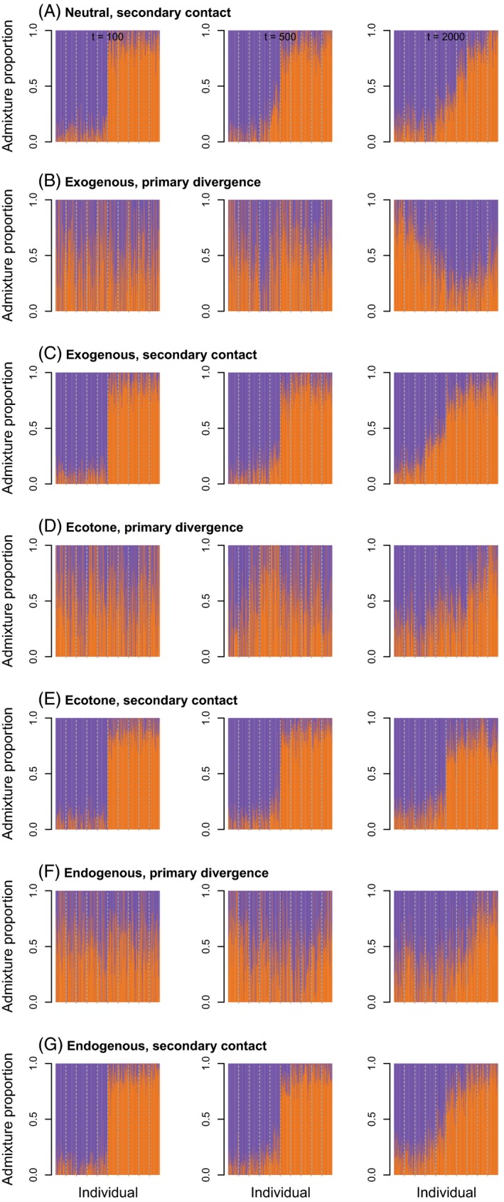
Barplots show maximum likelihood estimates of admixture proportions. Different colors denote ancestry from different hypothetical source populations. Here, we give results for a migration rate of 0.001 and 100, 500, or 2000 generations from a single set of simulations. Replicate simulations produced qualitatively similar results. Admixture from simulations with a higher migration rate of 0.01 is shown in Figure S4.