Figure 3.
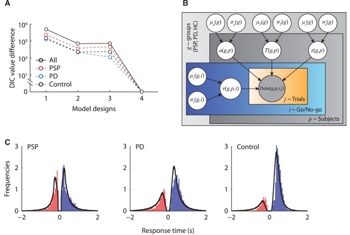
Model comparison and model fits. ( A ) The deviance information criterion (DIC) value differences between the best fit model (Model 4) and the other three model variants, for each group separately (dash lines) and all participants combined (solid lines). ( B ) The graphical representation of the best fit model. The shaded node Data( g,p,i,j ) indicates the observed data of each group ( g ), participant ( p ), condition ( i ) and trial ( j ). Nodes a , T er , z, and v are parameters of the drift-diffusion model, each with a group distribution for each patient group with mean µ and standard deviation σ . ( C ) Posterior predictive data distributions from the best fit model. The distribution along the positive x -axis shows the latency distribution in the Go condition (correct Go trials), and the distribution along the negative x -axis shows the latency distribution in the No-Go condition (commission error trials). Each panel shows the normalized histograms of the observed data and the model prediction (black lines). The area under the curve on the positive x -axis corresponds to the observed and predicted accuracy in the Go condition. The area under the curve along the negative x -axis corresponds to the commission error in the No-Go condition. PD = Parkinson’s disease.

