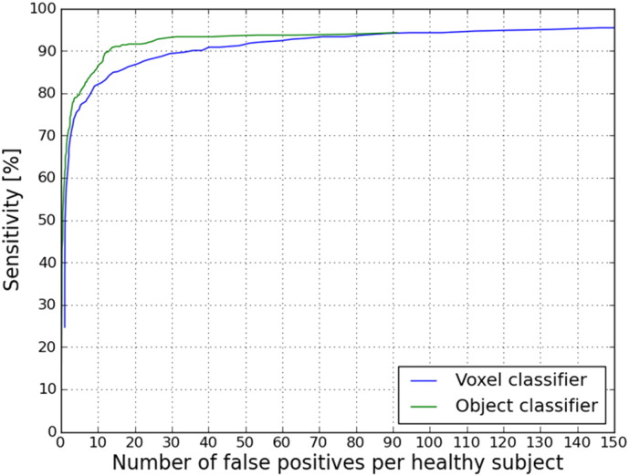
Fig. 8.
FROC curve of the CAD system result. The average number of false positives per healthy subject is plotted on the x-axis. The sensitivity compared to the expert annotation is plotted on the y-axis. In blue, the result after voxel classification. In green, the result after voxel- and object classification. (For interpretation of the references to color in this figure legend, the reader is referred to the web version of this article.)

