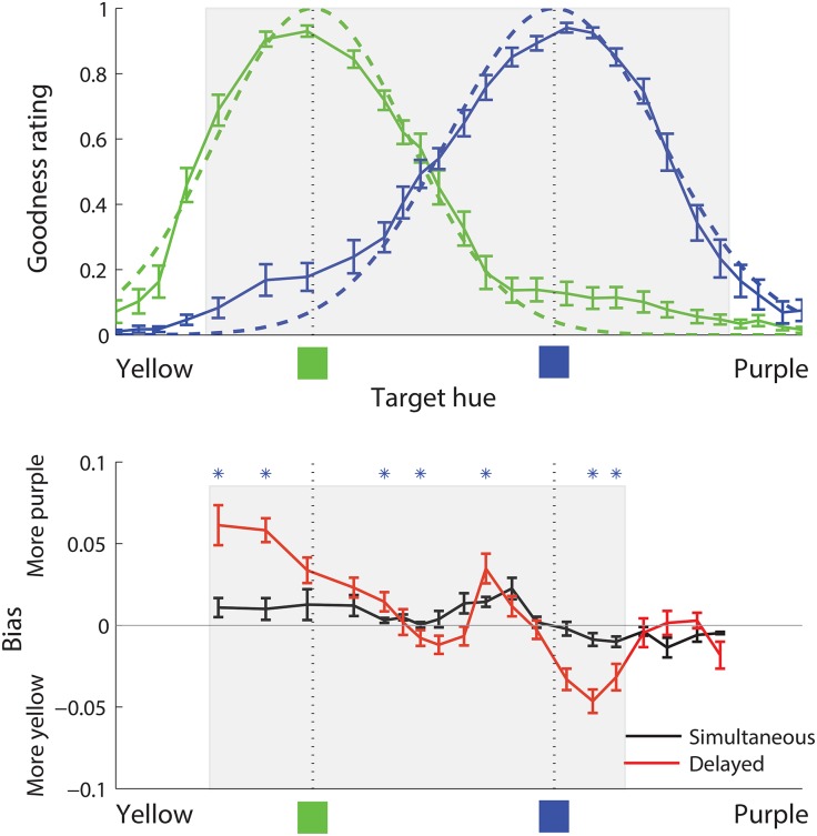
Fig 4. Naming and bias data, Study 1.
In both top and bottom panels, the horizontal axis denotes target hue, ranging from yellow on the left to purple on the right. Top panel (naming data): The solid green and blue curves show, for each target hue, the average goodness rating for English green and blue respectively, as a proportion of the maximum rating possible. The dashed green and blue curves show Gaussian functions fitted to the naming goodness data. The dotted vertical lines marked at the bottom with green and blue squares denote the prototypes for green and blue, determined as the means of the green and blue fitted Gaussian functions, respectively. The shaded region in the top panel shows the portion of the spectrum for which bias data were collected. Bottom panel (bias data): Solid curves denote, for each target hue, the average reconstruction bias for that hue, such that positive values denote reconstruction bias toward the purple (here, right) end of the spectrum, and negative values denote reconstruction bias toward the yellow (here, left) end of the spectrum. Units for the vertical axis are the same as for the horizontal axis, which is normalized to length 1.0. The black and red curves show bias under simultaneous and delayed response, respectively. Blue stars at the top of the bottom panel mark hues for which there was a significant difference in the magnitude of bias between simultaneous and delayed conditions. The shaded region in the bottom panel shows the portion of the data that was analyzed statistically, and to which models were fit. In both panels, error bars represent standard error of the mean.

