Figure 1.
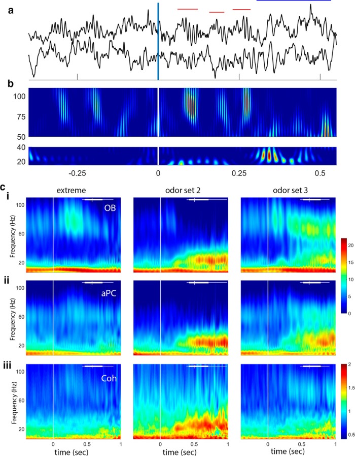
Data and frequency analysis. a, Sample voltage traces showing gamma (red horizontal bars) and beta (blue horizontal bar) oscillations during a single trial. The vertical line at 0 indicates nose-poke-on, with the estimated arrival of the odor stimulus at ∼60 ms (Frederick et al., 2011). OB is the top trace and aPC the bottom trace for the raw data. b, Gamma (top) and beta (bottom) band wavelet plots showing frequency over time from the data in a. Color represents power: red represents high. Note the sweep in frequency from higher to lower for the first two gamma bursts and the abrupt transition from gamma to beta just after 250 ms. c, Sample wavelet time-frequency plots showing three session averages (columns represent three different odor sets). ci, OB power: note strong gamma during early odor sampling for the extreme odor set, lower-power gamma and strong beta for odor set 2, and both gamma and beta power for odor set 3. cii, aPC power: note the similarity in beta power between OB and aPC. Gamma power in the aPC is much smaller than in the OB. ci, cii, The same color scale, which is in dimensionless units after normalization and log transform. ciii, Coherence between OB and aPC shows a decrease in strength during odor sampling in the lower frequency bands for the extreme odor set, and coherence overall is primarily limited to the beta band as reported previously (Kay and Beshel, 2010). Coherence is represented as Z-coherence (arctanh of coherence; see Materials and Methods). Vertical line at time 0 indicates nose-poke-on. White bar at top of each plot represents the distribution of end sampling times for each session.

