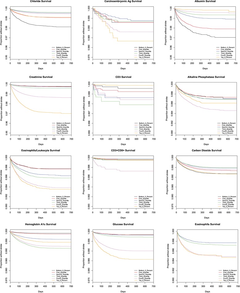
Fig. 3.

This figure presents Kaplan Meier survival graphs for 38 different laboratory tests. In each case, the graphs show the survival (percentage of the population who have not been diagnosed with a stroke) as a function of time. The population is broken up into five categories corresponding to those in the 5%, 25%, 50%, 75%, and 95%. The test values that correspond to those percentiles are given in Table 3. The 38 different survival graphs are separated into three panels: Fig 3, Fig 4, and Fig 5
