
Figure 2. Comparing Value between Better (focal) and Worse (control) Nursing Environments By Patient Risk.
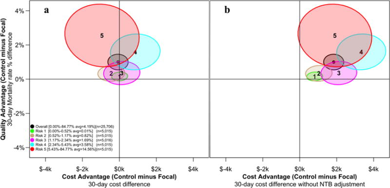
The x-axis of each plot represents the difference between the control minus focal patient matched pair for 30-day costs. Figure 2a describes costs, Figure 2b describes costs without adjusting for NTB differences across hospitals. The y-axis represents the difference between control-minus-focal matched pairs for 30-day mortality. The ellipses on these graphs represent the 95% joint confidence region for cost and quality. For each plot we display 6 ellipses, 5 including the same number of patients (N = 5,015) except the central ellipse that is based on all patients (N = 25,076). The ellipses in each figure are identical with respect to value, but differ in cost differences between focal and control patients. In Figure 2a, the second-to-the-highest risk group with the ellipse centered at “4” is completely above the horizontal line at y = 0, suggesting a significant advantage in quality for the focal group, while the intersection with the vertical line at x = 0 suggests that the increased costs in the focal group versus the control group did not reach statistical significance. In Figure 2b, we see that this same risk group displays lower cost with better quality in the focal group compared to the matched controls.