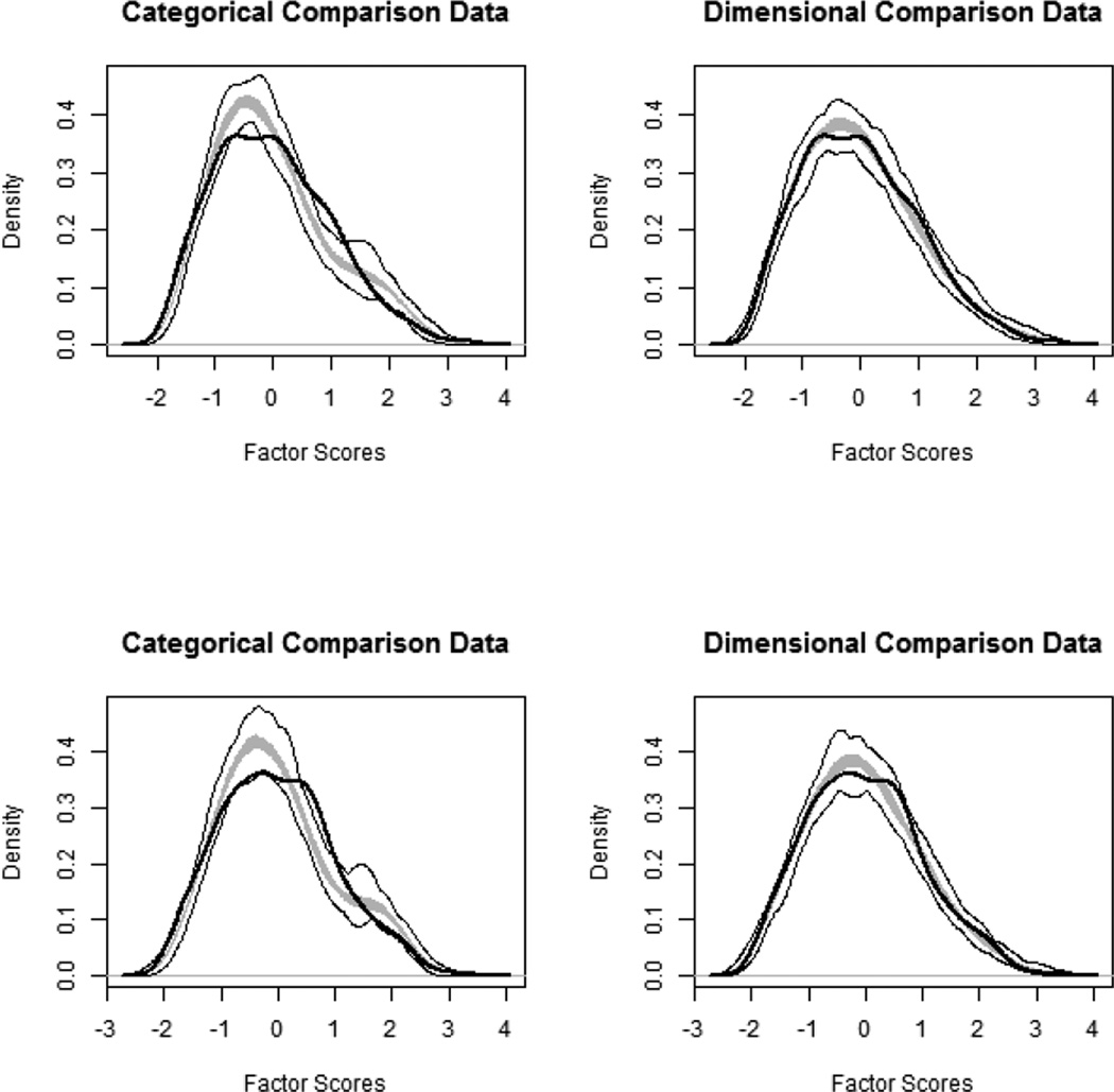
Figure 3.
Taxometric results for L-Mode curves relative to simulated taxonic and dimensional data. In each graph, the average curve for the sample data are represented by a dark line, with the gray area reflecting the middle 50% of the simulated values, and the light lines indicating the minimum and maximum simulated values at each data point. The top panels illustrate results for parent-reported data, and the bottom panels depict results for child-reported data.

