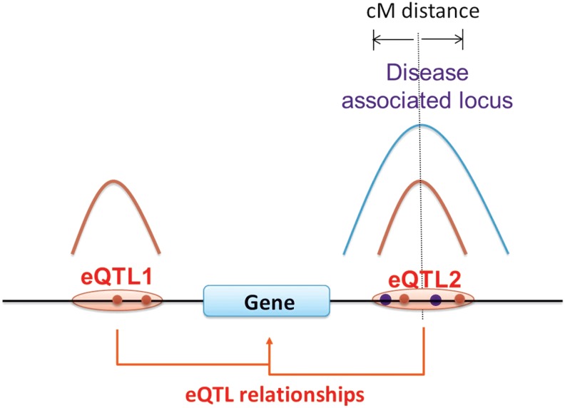
FIG. 2.
Model for identifying those disease-associated loci with a probable underlying expression mechanism. In this hypothetical case, a causal variant, at the position of the vertical dotted line, is related to disease susceptibility as a result of altering the expression level of the nearby gene. Because of LD, the presence of the causal variant will usually result in one or more nearby SNPs also being associated with disease risk, and the blue curve represents the expected p value distribution of these. Sparse sampling with a microarray and noise factors result in only one or a few of these associations being detected (blue dots). Since the causal variant affects expression, the same SNPs will be associated with expression level of the gene, with a colocated expected p value distribution, represented by the red curve, and again because of noise and other factors, only some markers will be identified (red dots). In this example, there is another eQTL in this region (eQTL1) where SNPs are associated with the expression level of the same gene, but unrelated to disease susceptibility, and so its eQTL p value distribution does not overlap with that for disease association.

