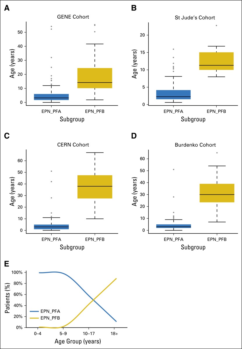
Fig A1.
(A-D) Boxplots of the age distribution of EPN_PFA and EPN_PFB, where boxes represent median and interquartile range and whiskers represent 95% CIs. (E) Proportion of patients with EPN_PFA and EPN_PFB in each age group. CERN, Collaborative Ependymoma Research Network; GENE, Global Ependymoma Network of Excellence.

