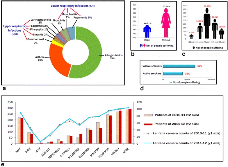
Fig. 1.

Comparative accounts for the interpretation of the hospital data and pollen counts. a Doughnut chart of various types of respiratory diseases in percentages (%) according to patients’ admission. b Male–female comparison from hospital survey. c Age group comparison from hospital survey. d Active–passive smoking comparison from hospital survey. e Comparative graph showing the blooming period of Lantana camara and patients hospitalization during 2010–2011 and 2011–2012
