
Figure 2.
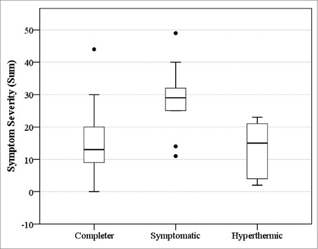
The sum of environmental symptoms severity for the march outcome groups (Solid line represents the median, the box represents the interquartile range (25–75% of the sample), the whiskers represent the bounds of 95% of the sample, and the single dots represent outliers – individuals whose data was 1.5–3 times outside the interquartile range).