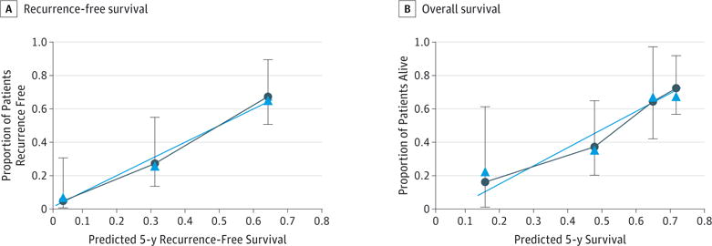
Figure 3. Calibration Plot Comparing Predicted and Actual Survival Probabilities at 5-y Follow-up.

The 30-sample bootstrapped calibration plot for the prediction of 5-y recurrence-free survival and overall survival is shown. The blue line represents the ideal fit; circles represent nomogram-predicted probabilities; triangles represent the bootstrap-corrected estimates; and error bars represent the 95% CIs of these estimates.
