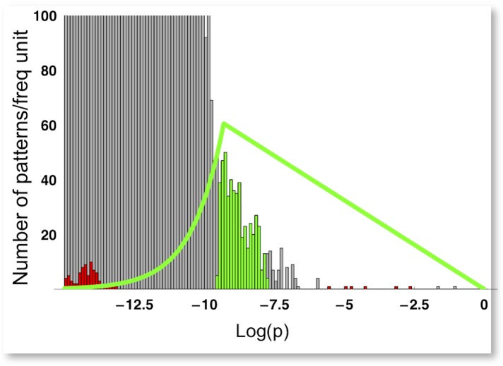
Fig 6. Patterns selection.
The gray histogram represents the probability distribution, in natural log scale, of the 227 possible 3x3 patterns, extracted from the dataset of RGB images used in this study [16]. The green curve is the model selection function with N = 500, W = 0.08. The green histogram is the probability distribution of corresponding selected patterns. The red histogram is the probability distribution of equiluminant patterns.

