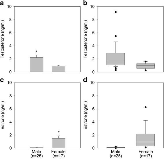
Fig. 4.

Comparison of mean testosterone (panel a) and mean estrone (panel c) concentrations for male and female DGFs. There was a significant difference in the mean concentration of testosterone (*, p < 0.05) and estrone (*, p < 0.05) between the sexes. Boxplots for each hormone are in panels b (testosterone) and d (estrone), with shaded regions depicting the quartile 1 to quartile 3 ranges, while whiskers indicate the 90th and 10th percentile. Dark circles indicate outliers beyond this range. The horizontal line within the box represents the median
