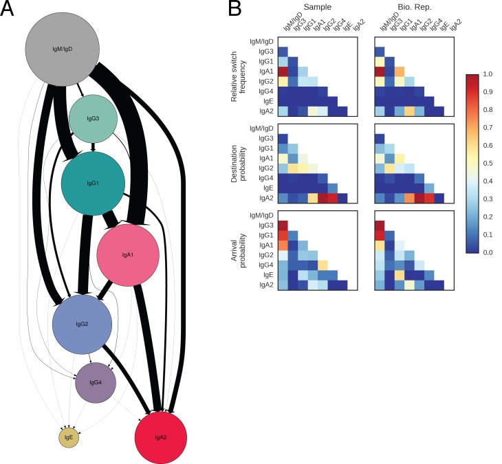
Figure 2. Landscape of human antibody class switching.
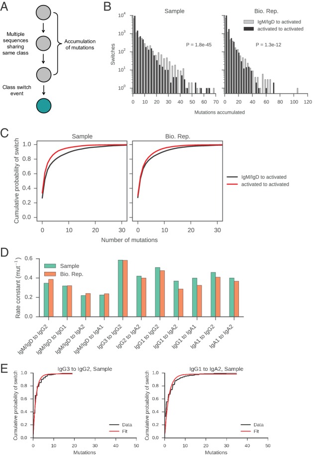
(A) State transition diagram of class switching. Classes are indicated as circles and possible switches as arrows. The radius of each circle indicates the relative abundance of the labeled class. The width of each arrow indicates the relative frequency of the switch (also reported in Table 3). Rare classes IgG4 and IgE have been omitted for clarity and are shown in Figure 2—figure supplement 8A. (B) Penetrance of direct switches from IgM/IgD. For each class, the fraction of sequences created by direct switching from IgM is shown (mean ± s.d. across n = 22 subjects for Sample and n = 14 subjects for Bio. Rep.). (C) Rates of CSR. The rate constant of each switch path was estimated by fitting an exponential probability distribution to the distribution of the number of somatic mutations accumulated prior to CSR (Figure 2—figure supplement 11). Distributions of rate constants for switch paths from IgM/IgD to activated classes (gray) and from an activated class to another activated class (white) having ≥500 examplesin both Sample and Bio. Rep. repertoires are shown.
DOI: http://dx.doi.org/10.7554/eLife.16578.013
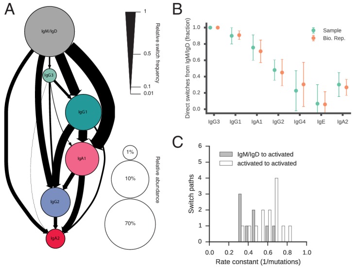
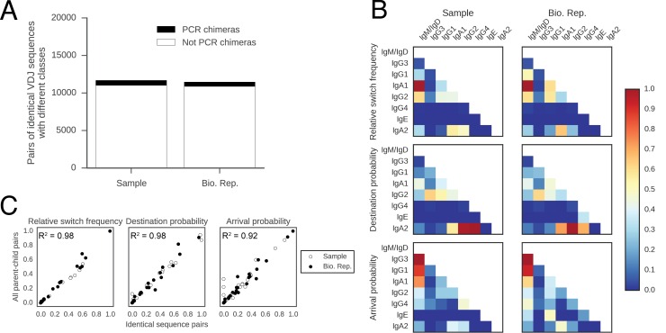
Figure 2—figure supplement 1. Patterns of class switching measured using sequences with identical VDJ sequences but different constant regions are highly similar to those measured using the full lineage reconstruction approach.
Figure 2—figure supplement 2. Patterns of class switching measured using sequences inheriting all germline mutations from parent are highly similar to those measured using the full lineage reconstruction approach.
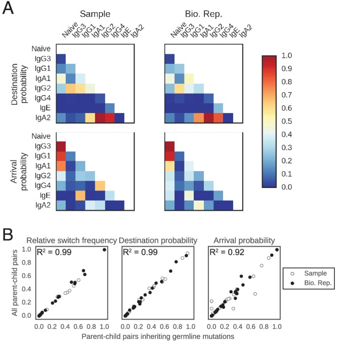
Figure 2—figure supplement 3. Patterns of class switching measured using sequences supported by consensus reads are highly similar to those measured using the full lineage reconstruction approach.
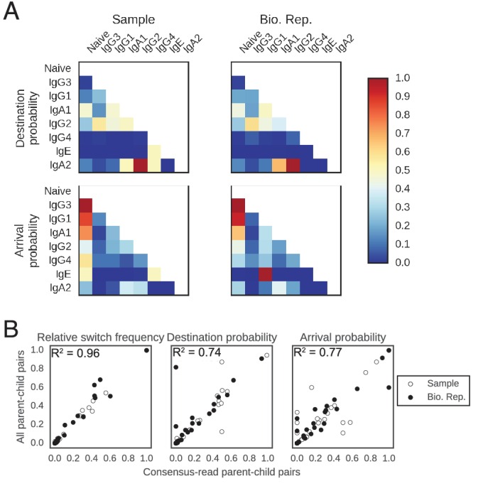
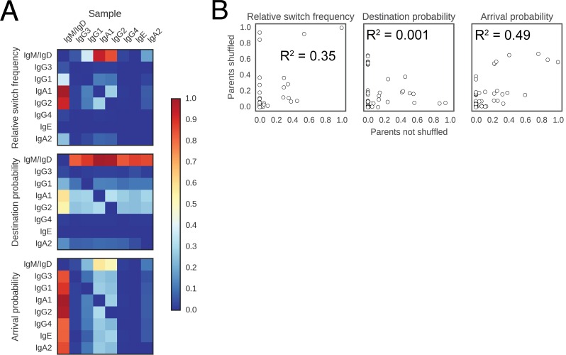
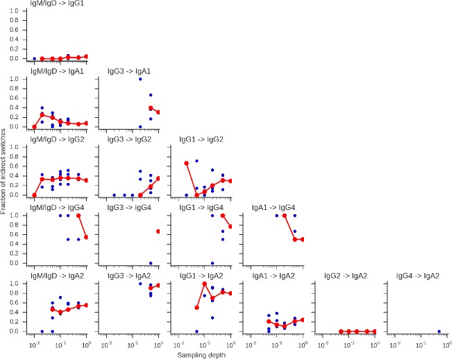
Figure 2—figure supplement 4. Landscape of class switching cannot be explained by random switching in proportion to the abundance of antibody classes.
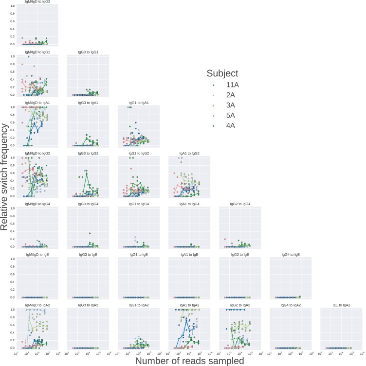
Figure 2—figure supplement 5. Landscape of class switching saturates with respect to sequencing depth.
Figure 2—figure supplement 6. Rarefaction analysis indicates that switch intermediates are robustly detected.
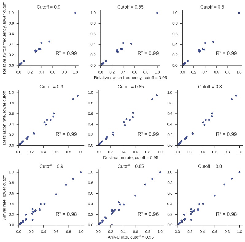
Figure 2—figure supplement 7. Class switching landscape is not sensitive to the lineage clustering cutoff parameter.
