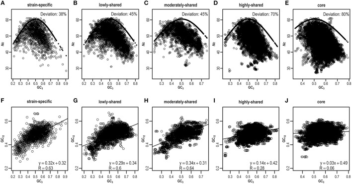
Figure 5.
ENC-plot (A–E) and neutrality-plot (F–J) across different gene sets. The expected and estimated values in ENC-plot are indicated by solid and hollow circles, respectively. For any given gene, if its deviation value, calculated by (expected–estimated)/expected, is greater than a threshold (default = 0.15), this gene is assumed to deviate from the expected ENC curve. Similar results can be found in Table S7 when considering different thresholds.

