
Fig. 3.
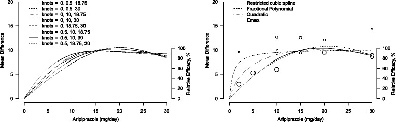
Graphical sensitivity analysis for the pooled dose-response curves between aripiprazole and mean change in Positive and Negative Syndrome Scale score. The placebo group (dose = 0) served as the referent group. Right axis represents percentage of the maximum predicted effect. Left panel: different location of the three knots in a restricted cubic spline model. Right panel: different models, restricted cubic splines (solid line), fractional polynomials (dashed line), quadratic polynomial (dotted line), and E max model (dot-dashed line). Circles indicate observed mean differences in individual studies; size of bubbles is proportional to precision (inverse of variance) of the mean differences