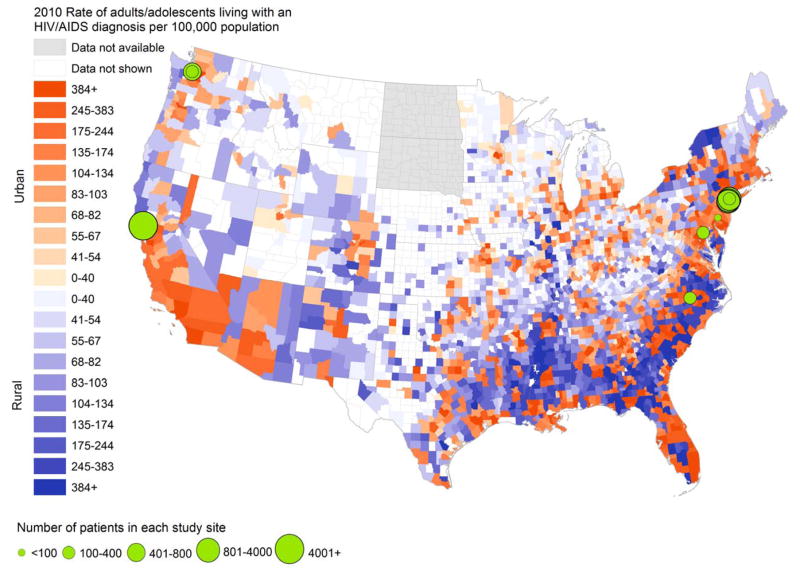
Figure 2. Geographic variation in study sites evaluating HIV care delivery models and county-level rates of HIV diagnosis.
This map shows county-level cases of HIV per 100,000 population, with counties shaded in darker colors indicating higher county-level rates of HIV. Counties shaded in orange are classified as urban, while those shaded in purple are classified as rural. The urban-rural classification occurs according to the 2013 Urban-Rural Continuum Codes from the United States Department of Agriculture from the Area Health Resources File, 2010 release. For this visualization, we included metropolitan counties (defined by population size of their metro area, and considered “urban”) and non-metropolitan counties (defined by degree of urbanicity and adjacency to metropolitan areas, and considered “rural”). Superimposed on this map are the sites of 9 studies meeting selection criteria. The sites for the remaining studies were either nationally representative or involved numerous sites statewide for which individual site sample sizes were not reported and therefore are not shown. Sources: AIDSVu (www.aidsvu.org), Emory University, Rollins School of Public Health on March 2, 2015, for county-level rates of HIV. Area Health Resources File (AHRF), 2010–2011, Rockville, MD: US Department of Health and Human Services, Health Resources and Services Administration, Bureau of Health Workforce.

