
Fig. 10.
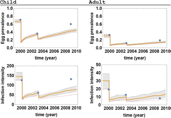
MDA control simulations for Milalani Village during the 2000–2009 period. The left panels represent children and the right panels represent adults. The ensemble prediction envelopes of prevalence (upper panels) and infection intensity (lower panels) based on current SWB simulations are shown in gray with their means represented by yellow lines. Blue circles represent observed field data. The dashed red line shows predicted control outcomes based on the earlier, simpler SWB model of [14]