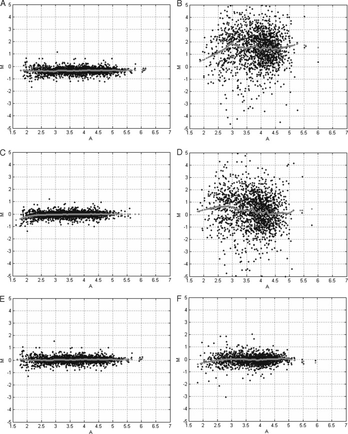
Fig. 4.
Minus-Additive (MA) plots. The x axis displays the average value of the log-intensities between two quantification channels. The y axis depicts the log2-ratio of the intensities between two quantification channels. The gray dots represent the result of a lowess smoother and indicates the center of the data cloud in function of the average log10-transformed reporter ion intensities. A, intra-experimental without normalization (A3 versus A4). Note the bias and low amount of variability that is attributed to the multiplexing. B, inter-experimental without normalization (A3 versus A5). Note the bias and large variability because of experiment-to-experiment variation typical for LC-MS. C, intra-experimental with quantile normalization. The bias is correctly removed by the normalization. D, inter-experimental with quantile normalization. The bias removed, however, the variability is large and obscures further statistical analysis. E, intra-experimental with CONSTANd normalization. The bias is correctly removed by the normalization. F, inter-experimental with CONSTANd normalization. The bias and the experiment-to-experiment variability is correctly removed from the data such that a statistical comparison becomes meaningful.

