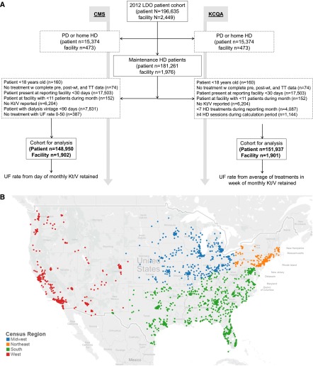
Figure 2.
The flow diagram shows selection of unique patient Centers for Medicare and Medicaid (CMS) and the Kidney Care Quaility Alliance (KCQA) cohorts by application of selection criteria on a rolling monthly basis, and the map illustrates the diverse locations of dialysis facilities included in the analytic cohorts classified by census region. (A) Flow diagram of patient and facility selection on the basis of the CMS and KCQA ultrafiltration (UF) rate measure specifications and (B) census regions of facilities included in the analytical cohort. HD, hemodialysis; LDO, large dialysis organization; PD, peritoneal dialysis; TT, treatment time; wt, weight.

