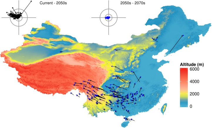
Figure 1. Predicted species movement in a climate scenario, using the BC45 scenario as an example.
The arrow represents the distance and direction of species geometric mean point at different periods. The black arrow presents climatic scenario of the 2050s, blue arrow presents climatic scenario of the 2050s–2070s. The wind roses summarize the distance and direction of shift for each species. The radiuses of rings on each wind rose represent geographical distance (inner circus: 2°; outer circus: 5°). The grey axis bars on wind roses represent a length of 7°. BC45 scenario represents BCC-CSM1-1 as AOGCM and using RCP4.5 as greenhouse gas scenarios. The figure was generated using R (http://www.R-project.org/), ggplot2 (https://cran.r-project.org/web/packages/ggplot2/index.html) and raster (http://CRAN.R-project.org/package=raster) softwares, and the map was created using data downloaded from the GADM database (http://www.gadm.org/) for free use.

