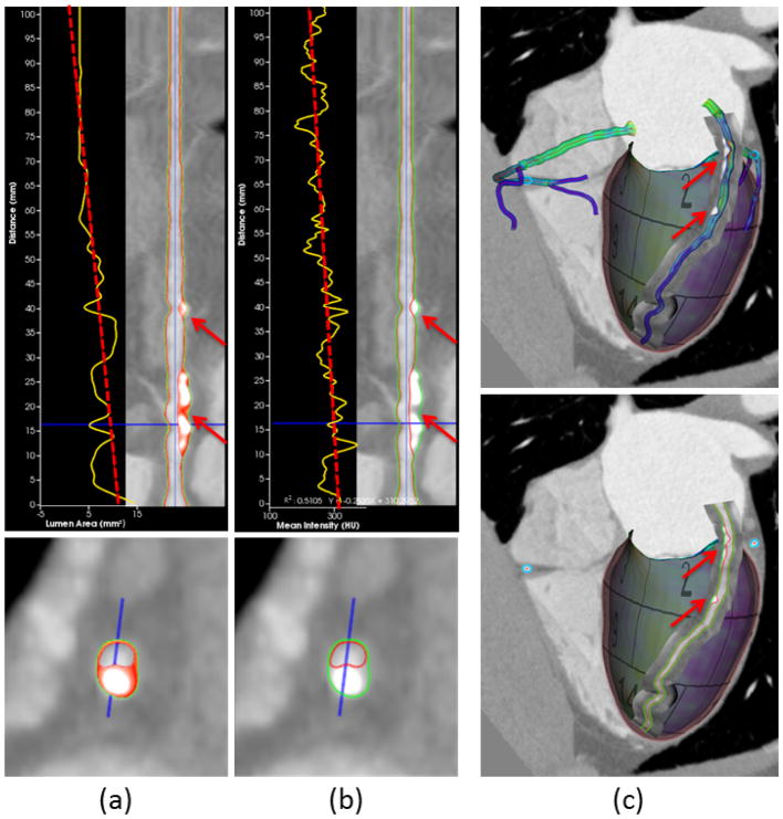
Fig. 7.
Curved reformatting of coronary arteries. (a) The plot of lumen area versus the distance along the centerline (yellow curve) with least squares fitting (red dashed line). Color overlay on the vessel wall depicts the composition of different plaque types. (b) The plot of mean intensity shows transluminal attenuation gradient [49] from proximal to distal. (c) Direct curve reformatting in 3D with surface models and delineated borders of coronary arteries. The red arrows in all subfigures point to the calcified and noncalcified plaques in the vessel wall.

