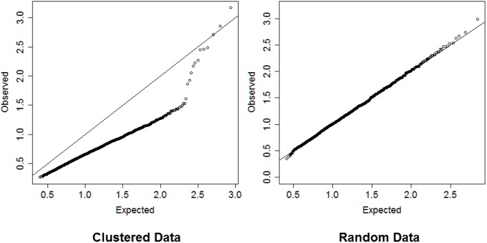
Figure 2.
Left panel: QQ-plot comparing expected and observed normalized distances used in hierarchical clustering of 2000 profiles of 16 variables generated from 13 clusters. Right panel: QQ-plot comparing expected and observed normalized distances used in hierarchical clustering of 2000 profiles of 16 variables generated from only one cluster. The QQ-plot is consistent with the hypothesis that when there are real clusters in the data, profiles in the same cluster should be more similar than profiles from random (unclustered) data and should produce distances that are smaller than what expected in unclusterd data, while profiles in different clusters should be more different than profiles from random data and should produce larger distances than expected by chance. Therefore, a QQ-plot with a clear S-shape as depicted in the plot on the left panel would suggest the presence of very distinct clusters in the data.

