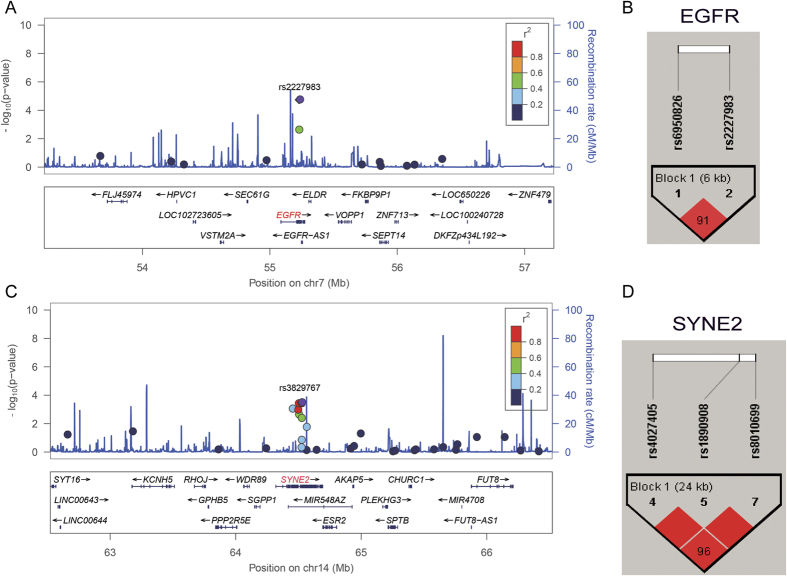
Figure 2.
LocusZoom plot for analysis of local linkage disequilibrium (LD) and recombination patterns nearby EGFR (A) and SYNE2 (B) about 2 Mb. The left vertical axis shows association P-values on the −log10 scale, the right vertical axis shows the recombination rate and the horizontal axis shows the chromosomal position. The bottom of plot shows the near gene. The purple diamond is the most significant SNP at each plot. LD (r2) and recombination rate are estimated from the 1000 Genomes Project ASN data (March2012, build GRCh37/hg19). (C) Haploview LD graph of SNPs in EGFR was visualized using the Haploview software 4.2. (D) Haploview LD graph of SNPs in SYNE2 was visualized using the Haploview software 4.2. Haploview linkage disequilibrium plots display using the standard color scheme, the number on the cell is the LOD score of D’.

