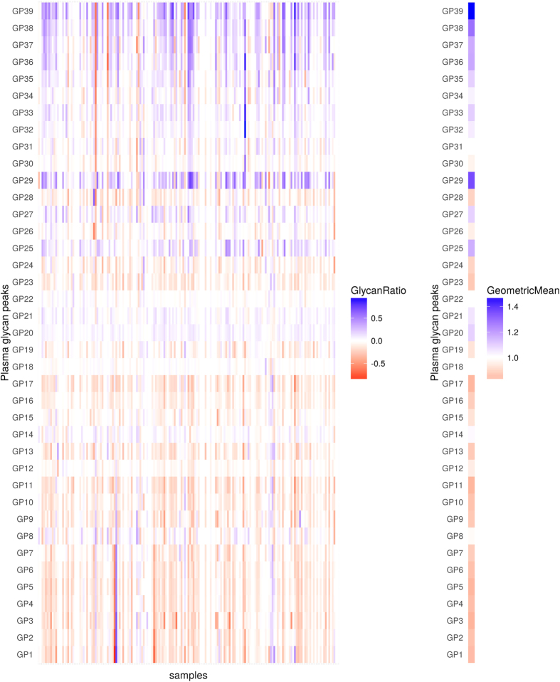
Figure 2. Changes in levels (abundance) of plasma glycans between day 0 and day 2 for the discovery cohort.
Changes are presented through the logarithm of relative changes log10 (day2/day0) in the left plot and the geometric mean (as a measure of trends) of relative changes (day2/day0) in the right plot. The red color indicates decrease in glycan level and blue color indicates increase in glycan level; intensity of colors indicates the intensity of the changes. All changes are presented with respect to levels before the surgery.

