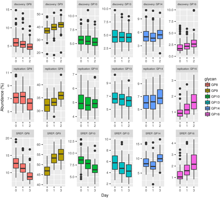
Figure 5. Graphical comparison of changes in glycan levels between the discovery cohort, the replication cohort and previously published data20 (SREP) as an additional replication of the results.
The comparison is given through boxplots where the bottom and top of the box are the first and third quartiles, and the band inside the box is the second quartile (the median). Ends of the whiskers represent the lowest datum still within 1.5 IQR (interquartile range) of the lower quartile, and the highest datum still within 1.5 IQR of the upper quartile. Data beyond the end of the whiskers are outliers and plotted as points. Only a subset of directly comparable glycans is shown due to differences in measurement technique for the replication and discovery cohorts (Ultra-performance liquid chromatograph) and previously published data (High performance liquid chromatography). Statistical inference was not performed between cohorts.

